Serif fonts have a lengthy history and enduring appeal. Serif typefaces radiate sophistication and professionalism thanks to the decorative strokes, or serifs, that extend from the extremities of the letters.
Due to their capacity to improve readability and provide a sophisticated touch, they are frequently utilized in print media, branding, and long-form material.
This in-depth guide will cover the properties of serif fonts, their classifications, well-known uses, and helpful hints for choosing identity fonts and employing them efficiently.
Using Serif Fonts Correctly:
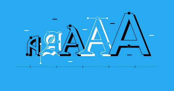
- In typefaces known as serif fonts, little decorative strokes, or serifs, are present at the extremities of the letterforms.
- Origins: Serif typefaces have a long history, going all the way back to ancient Rome, where they were first created to improve legibility on stone engravings.
- Important Characteristics: Serif fonts are renowned for being very legible, readable, and formal in appearance. They exude an air of authority and heritage.
- Visual Elements: Serif fonts display a number of aesthetic features, such as bracketed serifs, changing stroke thickness, and clear contrasts between thick and thin lines.
Serif Font Classification:
- Old Style: Old Style serif fonts have bracketed serifs, diagonal stress, and a reasonable contrast between thick and thin strokes. They were influenced by ancient calligraphy. Examples are Bembo and Garamond.
- Transitional: These serif fonts were created in the 18th century and have sharper serifs, more contrast, and vertical stress. Popular examples include Baskerville and Times New Roman.
- Modern: With a sharp contrast between thick and thin strokes, vertical stress, and hairline serifs, modern serif fonts first appeared in the late 18th century. The traditional modern serif typefaces Bodoni and Didot.
- Slab Serif: Slab serif fonts have regular stroke widths and thick, block-like serifs. They give off a strong, confident appearance. Rockwell and Courier are a couple of examples.
Common Serif Fonts:
- Times New Roman: Originally created for The Times newspaper, this timeless and adaptable serif typeface is popular due to its readability.
- Georgia: Georgia has a higher x-height, open letterforms, and liberal spacing and was designed for on-screen legibility. For web material, it is frequently used.
- Baskerville: With its great contrast and distinct serifs, Baskerville is a beautiful and classic serif font. Both print and digital media can use it.
- Garamond: This typeface is well-known for its elegance and legibility and is named after the illustrious French engraver Claude Garamond. It features a balanced design.
- Caslon: Caslon, a flexible serif typeface with a lengthy history, is renowned for its readability and wide variety of styles. Editorial design frequently makes use of it.
Advice on Selecting and Employing Serif Fonts:
- Purpose and Context: Take into account the project’s purpose and context. Serif fonts are great for formal and classic designs, but they might not be appropriate in every situation.
- Readability: Give readability first priority by selecting serif fonts with a medium stroke contrast and clearly defined serifs. Avoid overly elaborate or ornamental patterns.
- Pairing: To generate contrast and hierarchy, serif and sans-serif fonts can be used together. Make sure the fonts blend harmoniously and complement one another.
- Size and Spacing: Change the font size and spacing depending on the reading distance and the medium. Legibility is improved, especially in print, by larger sizes and wider spacing.
- Emphasis: To lend emphasis and hierarchy to particular elements, use the bold or italic variations of the chosen serif font family.
- Brand Consistency: If serif typefaces are being used. To maintain a consistent brand identity for branding purposes, guarantee uniformity across all media and apps.
- Test and Iterate: To make sure your chosen serif font fulfills your design and communication objectives, always test it in the medium you intend to use and get feedback.
In summary, serif fonts have endured over the years, adding class, readability, and a hint of tradition to innumerable designs. Serif fonts are categorized and have qualities that enable designers to choose the best ones for their projects.
Serif fonts provide a wide selection of options appropriate for various circumstances, whether it is for print media, branding, or digital material. You can confidently choose and use serif fonts to elevate your designs and successfully convey your message with elegance and sophistication by using the advice provided in this article.
Serif Fonts: Frequently Asked Questions (faqs)
How do serif typefaces work?
Serif fonts are typefaces with little decorative strokes at the extremities of the letterforms, or serifs. The fonts look more conventional and official because to these serifs.
For what purpose are serif fonts used?
Serif fonts are frequently employed to improve readability, especially in long-form text and print media. They are frequently connected to authority, professionalism, and a sense of tradition.
Are serif fonts appropriate for web or digital design?
Serif typefaces can be used successfully in computer and web design, yes. Serif fonts are a wonderful option for websites, blogs, and other online publications because many of them have been enhanced for on-screen legibility.
Click Here – What Is Dedicated Truck Driving?
How do serif and sans-serif typefaces differ from one another?
Sans-serif fonts lack the ornamental serifs included in serif fonts. Serif typefaces have a more conventional and elegant feel, whereas sans-serif fonts are frequently seen as being more contemporary, clear, and uncomplicated. The aesthetic and communicative objectives of the design will determine whether serif or sans-serif fonts should be used.
Can logos and branding utilize serif fonts?
Serif fonts can be used for branding and logos, yes. But it’s crucial to pick a serif font that complements the character and principles of the brand. A logo or branding design can benefit from the refinement and timeless appeal of serif fonts.